hexagon logo

Can I use scPOST to create a graph of a flow variable where two plane intersect?

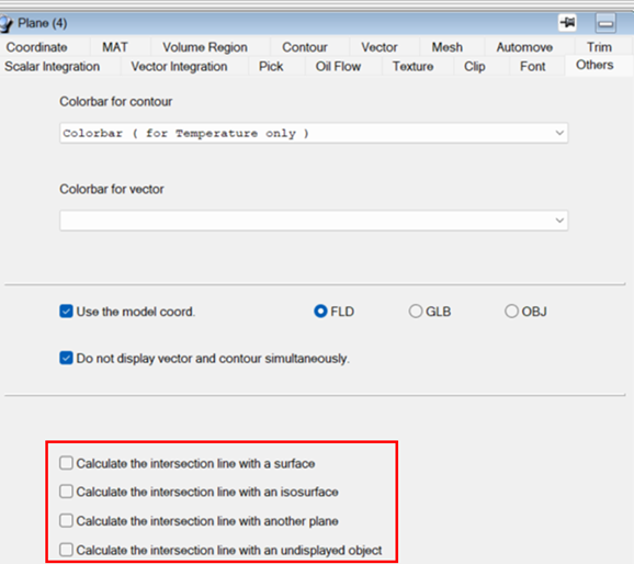
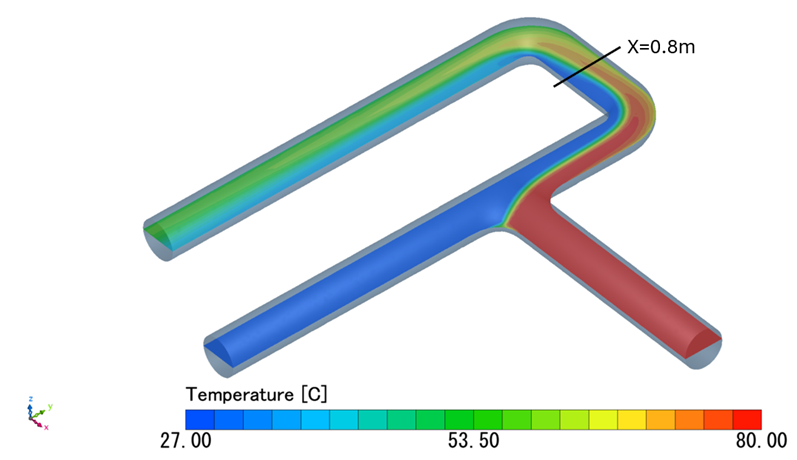
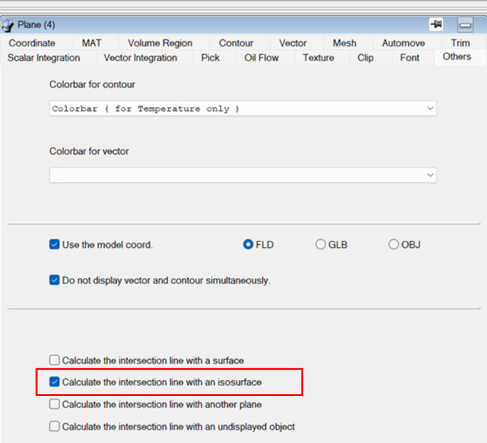
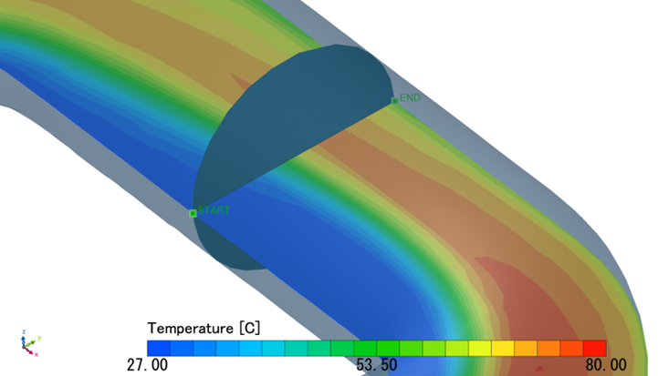
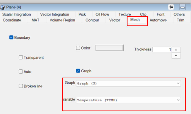
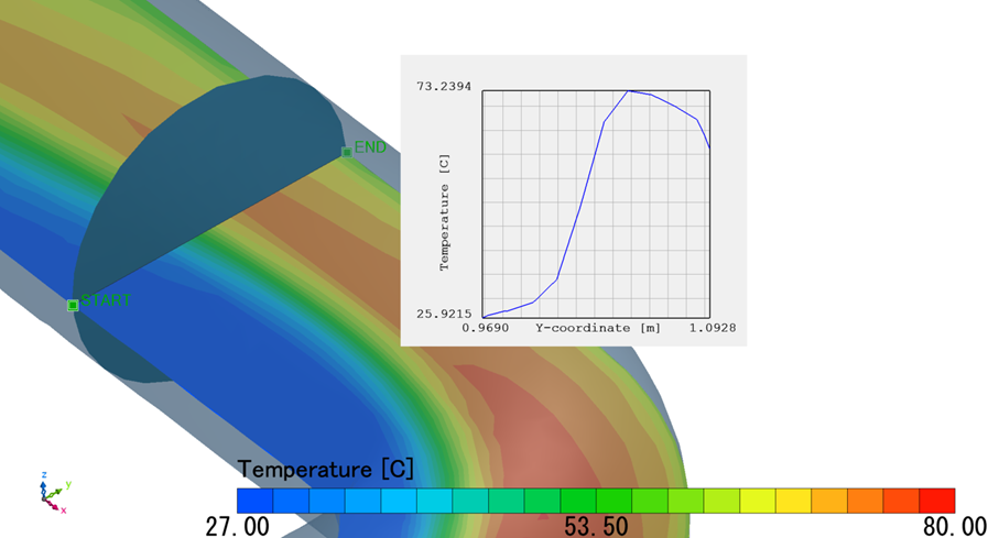
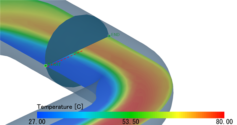
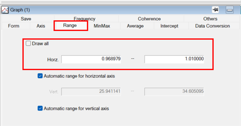
I would like to create a graph of the variation of a flow variable along the intersection line between two planes.  Is there a way to do this in scPOST, using my FPH-file results?  The glider example in the Operation manual shows how to do this for a plane intersecting a surface, but is something similar possible for two planes?

Parents
  • Hello David,

    Thanks for posting your question to the Cradle CFD Community Forum.

    It is possible to intersect a plane with different objects such as surface, isosurface, and another plane. This intersection option is available in the [Plane]-[Others] tab:


    To illustrate this, let’s look at a tutorial example where we intersect a plane with an isosurface and then plot the temperature along the intersection line.

    Consider the temperature field on a y-plane, and we would like to visualize the temperature along the intersection line with x=0.8m plane, as shown below:

    After we visualize the temperature field as shown above, enable the [Calculate the intersection line with an isosurface] toggle:


    Then, create an Isosurface and set the [Variable] to [x-coordinate]=0.8. The Isosurface will be created and displayed. Note that the [STAR] and [END] points are the beginning and end of the intersection line between the plane and isosurface.


    Next, on the [Plane]-[Mesh] tab, enable the [Graph] toggle and select Temperature as the [Variable].

    Lastly, navigate to the [Graph]-[Axis] and change the H-Axis to Y-Axis, this will set the horizontal axis of the plot to y-coordinates. The resultant graph of temperature along the line is then displayed.


    This is just an example of how to use the intersection functions within the post-processor. If you have a specific use case in mind that you need assistance with, let me know!


  • Hi Rodrigo,

    Thank you very much for the detailed answer and quick response!  I tried following your steps with my simulation results and it worked well.  I got the graph I was looking for.

    Just one follow-up question:  I don't really want my graph to cover the full extent of my domain.  So, what is the best way to limit the range of the graph?

    Should I manually drag the [START] and [END] points?  Or is there a better way?

    By the way, I am modeling flow over an airfoil and I need to graph the variation of a few field variables above and below the airfoil at different chord locations.  But I can see that the method you explained will be useful for many applications.

  • Hello David, 

    Thanks for your follow-up question. You can certainly modify the range in the graph. For instance, in the example of the pipe flow, let's say we would like to visualize the temperature from one end of the pipe wall to the center line, as depicted in the red-dotted line below:


    You can modify the range of the horizontal axis by navigating to [Graph]-[Range], deselect the [Draw all] toggle, and specify the coordinate of the centerline location. In this example, this corresponds to approximately y=1.01. This change will update the extents of the graph in the display window. 

    This technique is not only applicable to the pipe flow case, but it can also be used in your airfoil case to visualize flow quantities above and below the airfoil at different chord locations. 

    I hope this helps, and please let me know if you have any follow-up questions.

  • Hi Rodrigo,

    Thanks for your additional help on this!  Using the [Graph] - [Range] settings works well.  It's more precise than manually dragging the [START] and [END] points.

    That answers all my questions for now, thank you.

Reply Children
No Data