Using gantt charts (beta)
This document will be superseded by the User Guide after all functions are final.
Gantt Charts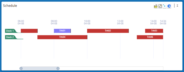
Gantt charts are a type of calendar that shows entries on a horizontal timeline. Each record in the table is a bar in the chart, with the additional ability to group the bars (records) based on a common property. Gantt charts are used for scheduling such things as crews on jobs, orders at work cells, trucks at loading docks or vehicles in repair bays.
Create a Gantt chart
A Gantt chart is a new kind of query. When you create your query use Gantt Chart as the Display As value: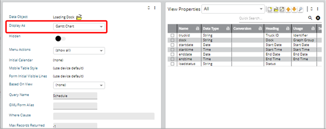
The view properties are similar to those of a calendar because a Gantt chart is a kind of calendar. Here you see that we have specified the identifier as well as the start date and time and the end date and time. All of these work the same way as they do in a calendar.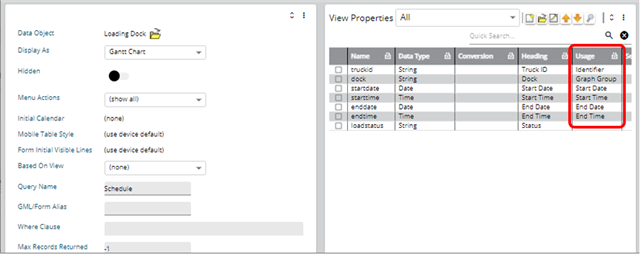
In the illustration above you see that we used separate date and time properties for start and end. The times are optional; you may use only dates if that’s how you schedule. You may also use timestamps.
A key feature of the Gantt chart (and one not found in calendars) is the graph group.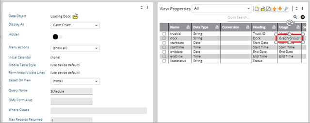
The graph group is the property that will appear on the Y-axis of the Gantt chart. All the records with the same graph group will appear on the same horizontal timeline. In the illustration above the Dock property is used as the graph group.
Once you have defined your Gantt chart you can use it like any other: put it on a workbench, in a query details section, etc.
Using a gantt chart
Basic Functions
When you launch a Gantt chart you will see something like this: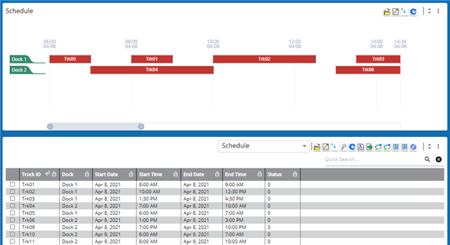
In this illustration we show two queries, a Gantt chart and a table. Both show the same data. The following comments refer to the Gantt chart.
All records in the same graph group will appear on the same line. In our illustration you can see four records for Dock 1.
The Y-axis is the graph group. Normally you will make the graph group the sort for the query but this is not mandatory. Each unique graph group will appear in the order in which it first appears in the data set.
The X-axis is time and is positioned at the top of the data. The time horizon in the data is from the earliest start time to the latest end time. The initial time horizon displayed is the earliest 25% of the time horizon in the data.
- In the query definition a where clause can subset the data including the time horizon.
- In the query definition an X axis range can specify the time horizon (see below)
- The time divisions and units are dynamic. They will adjust according to the data and the zoom slider (see below).
Each bar in the Gantt chart is like a record in a table query so you can double-click a bar to perform the default action.
- Time Slider
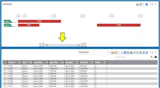
At the bottom of the Gantt chart is a slider indicated by the yellow arrow in the above illustration. You can move this slider as follows:
- Click and hold the slider in the middle to drag it right or left. The entire time scale moves with it.
- Click and hold the end of the slider to make the slider longer or shorter. This has the effect of zooming in or out.
You can use these two gestures in combination, such as to move the entire timeframe and then zoom in.
- Data annotations
You can apply data annotations to a Gantt chart to change the color of the bar. In the illustration below we changed the bar to purple when the status is 2.
Note that we have two queries shown below. The table query has a similar data annotation applied.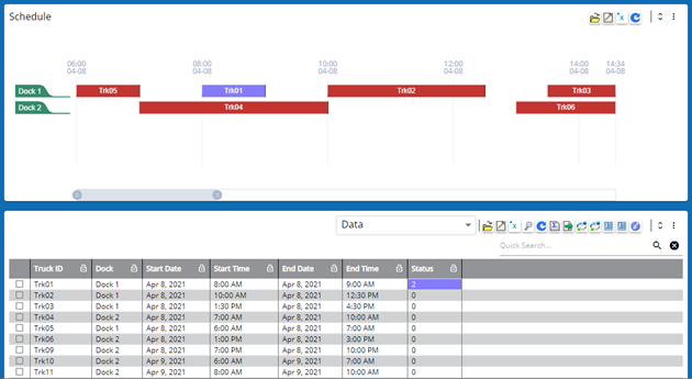
You may use a data annotation with your Gantt chart. This will change the color of the bar for the record affected. In the example below we will make the bar purple when the status is 2:
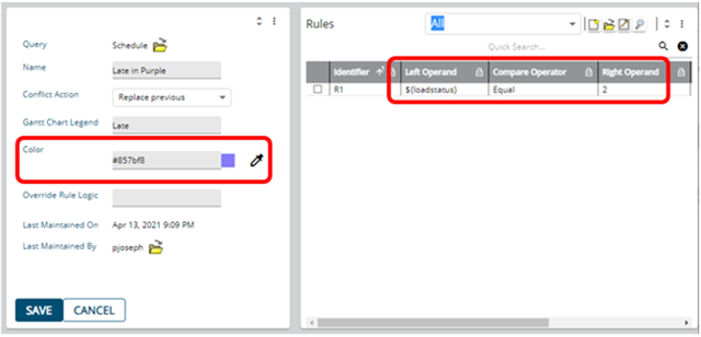
- Query settings
Hover Detail
You may specify a detail to be used for hover text. When your cursor hovers over -- or just touches -- a bar the text will appear:
The Gantt Chart Hover Detail is specified as part of the query. In our example we created a detail called Tip Text: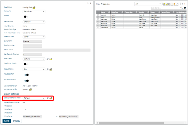
The Gantt chart will use the list of properties in the first property section for the hover detail, ignoring any column breaks. Any additional property sections and any query sections will also be ignored.
X-Axis Range
Typically your data will contain a wide range of dates, including some in the past that are no longer of interest. To narrow your time range you can specify an X-Axis range. In our example we specified a beginning range of “today” using ${CURRENT_DATE} and an end range of “tomorrow” using ${CURRENT_DATE+1DAY}. This limits all the records in the Gantt chart to those with start and end dates within that range.
You can also use the query Where clause to filter the records in the Gantt chart.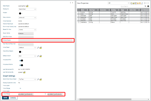
The difference between using these two features is:
- X-Axis Range applies to the timeline. Only records that start and end inside this range will be included. You will see all the graph groups even though the ones for dates outside the range will appear empty.
- Only the records and graph groups included in the Where Clause will appear in the Gantt Chart.
