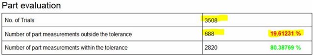
In the report below this shows the total number of parts measured "3508". Number of parts failed "688". Number of parts passed "2820" and there percentages.
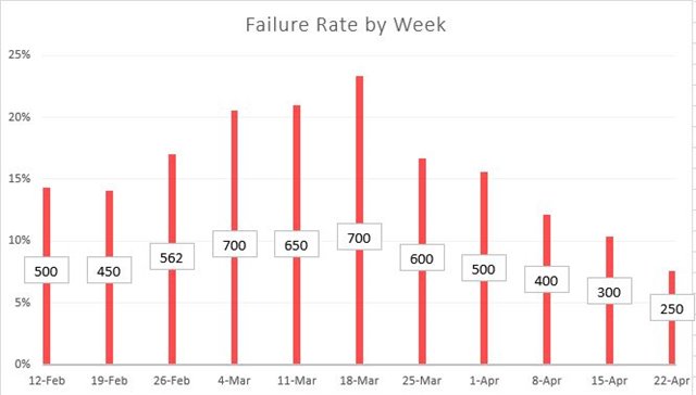
I would like a way to graph the percentage of parts failed over time by days, weeks or months.
This would allow us to see how many parts are being rejected over time to see if we are improving or getting worse.
This graph below was made in excel as an example of how this could look. This is looking at the data over time in weeks.
Red bars showing percentage of failed parts.
Boxes with with numbers are showing total parts failed during the week.
This data shows number of failures peaked during the week of March 18th with almost 25% "700 total parts rejected" and from there the process has improved from the last week of April 22nd with just over 6% "250 parts rejected."