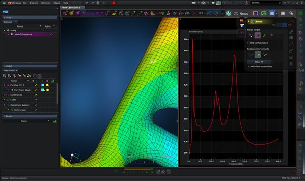
How do I use the XY Chart functionality in Apex? I click on the lime green graph button in the top right, but then I can't find any way to edit or add data to the chart that shows up.
How do I use the XY Chart functionality in Apex? I click on the lime green graph button in the top right, but then I can't find any way to edit or add data to the chart that shows up.
You first need to create a fringe or vector plot of the response you are interested in, then select the green graph button. Once the blank chart is up, select the Probe tool and select the node/element you are interested in plotting the response for.
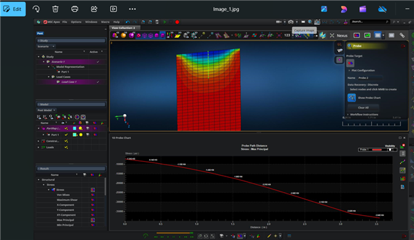
It sounds like you are trying to create an xy plot of the max principal stress along a path? If that is the case then you need to plot the fringe plot, then select the Probe Tool which has the little curve above above it (Probe plot results along a 1D path). You don't need to select the Create XY Chart View first. Just go straight to the Probe plot results along a 1D path icon, and it will pop up an xy window as shown in the image below. Then just select the nodes along the path you are interested in. The middle mouse button to populate the xy chart.
Thank you doing it along the nodes gets me close enough to what I was trying to do.
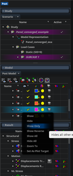
One last question: Is there a way to show individual elements in the Post Processor? I can change the pick filter in the modeler and right click on an element to Show Only it. But the same thing in the Post Processor doesn't work.