The output points for the value fields can also be configured to display the measured values as bars. 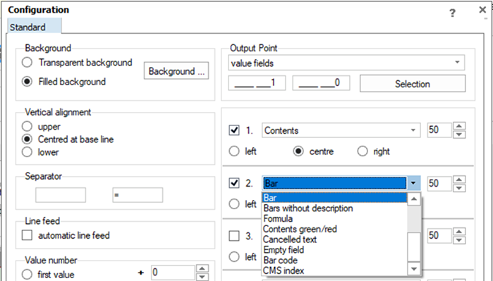
The appearance and colour of a bar indicates the status of a measured value.
| Bar Colours | Meaning of the colour |
 |
The measured value is within the tolerance. The width of the bar represents the deviation. |
 |
The measured value is perfectly within the tolerance. The deviations are so small that the bar displayed would hardly be visible. This is why the diamond symbol is appears. |
 |
The measured value is exactly at the specification value (warning limit). |
    |
The colours orange and red are used to indicate measured values outside the specification limits. |
Bar chart for characteristics with natural limits
When using characteristics with natural limits, the ribbon bar provides additional settings for the display of the bars.
| Option | Description |
| Bar chart in grey Shows the range from the natural limit to the centre of tolerance in grey. |
|
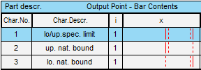
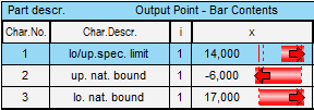
| Bar chart placed in the centre Shows the natural limit in the centre of the bar chart. |
|
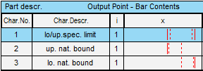
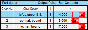
| Bar chart not in the centre Shows the range from the natural limit to the measured value. |
| Enabled option | Example with no values | Example with measured values |
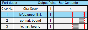 |
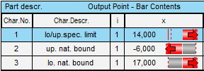 |
|
 |
 |
|
 |
 |
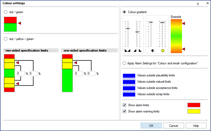
Setting the colour scale
The "Graphical settings" tab on the ribbon bar provides the dialogues for configuring the colour scale.
The detailed configuration dialogue is accessed by pressing the "..." button. 