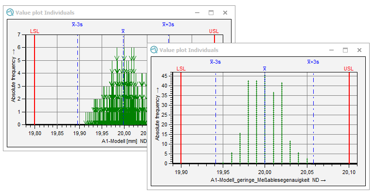
The value plot illustrates the distribution of the values and their frequency per scale value. Each value is displayed by an arrow. In case the same value occurs twice, a second arrow is displayed on top of the first arrow and in case of three equal values, the graphic shows a stack of three arrows, etc. the x-axis shows the value range and the frequency is plotted on the y-axis. The time is not considered in this graphic. The value plot helps to determine whether the resolution of the measuring equipment is sufficient. If more than 20 actual value plots are possible within the tolerance, the resolution is sufficient. You may also evaluate how the resolution relates to the variation or the specification limits, in case these statistics are shown in the value plot. So you will be able to make a rough guess on the capability of the measuring equipment regarding its resolution (>5% of the tolerance).
In addition, irregularities and strange patterns in the value plot often indicate a lack of data quality.

|
General configuration
Options for general graphics configuration are stored in the "Graphical settings" tab. Link to Q-DAS Graphics - General Configuration |
||
| Working with the graphics The "Part / characteristic" tab provides options and functions for working with graphics. These include various data selection options for display and evaluation, as well as various configuration options for the displaying multiple characteristics. Link to Working with the Q-DAS Graphics
|
