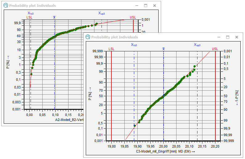
The probability plot is closely related to the cumulative line. By transforming the ordinate (y-axis) of the distribution function of the cumulative line, you gain the probability line. Depending on the distribution model on which the data is based, different probability plots are created. In order to determine the probability line, the individuals or the class frequencies of a frequency diagram are plotted. The statistics you choose depend on the subgroup size. In case the values in the probability plot of the normal distribution approximate a straight line, you may assume a normally distributed population. In addition, you can find the average at 50% in the probability plot and the standard deviation, which is half the interval between 16% and 84%. Process location and process variation may this be defined based on the probability line. In case you also specified specification limits, the intersections with the straight line help to estimate the fractions non-conforming. Compared to the cumulative line, the probability plot increases the accuracy of estimate by spreading the scaling at the margins. Note: Each distribution has a different scale for the ordinates (and sometimes for the abscissa as well) and hence its own probability plot.

|
General configuration
Options for general graphics configuration are stored in the "Graphical settings" tab. Link to Q-DAS Graphics - General Configuration |
||
| Working with the graphics The "Part / characteristic" tab provides options and functions for working with graphics. These include various data selection options for display and evaluation, as well as various configuration options for the displaying multiple characteristics. Link to Working with the Q-DAS Graphics
|
